
Building a layout that works on every screen is something you run into very early. At first it feels confusing. You make something that looks fine on your laptop and then you check it on your phone and everything looks off. That is a normal part of learning.
Instead of trying random fixes it helps to understand one simple system. Flexbox is one of the easiest ways to control layout without fighting the browser. Once you get used to it things start making more sense.
In this tutorial we will build a small layout from scratch. Nothing fancy. Just something real that you can test and understand step by step.
Main Idea
The goal here is simple. A layout should adapt naturally instead of forcing elements into one fixed shape.
1. Create a Simple Structure
Start with a basic layout. Do not overthink it.
<div class="container">
  <header>Header</header>
  <main>Main Content</main>
  <aside>Sidebar</aside>
</div>
This is enough to understand how the layout behaves before adding more complexity. You can always expand it later.
2. Apply Flexbox
Now turn the container into a flex layout.
.container {
  display: flex;
  gap: 20px;
}
You will notice that everything moves into a row. No floats, no hacks. Just one line and it works.
3. Add Basic Styling
Now let us make it visible so we can understand spacing.
header {
  width: 100%;
  background: #111827;
  color: #fff;
  padding: 20px;
}

main {
  flex: 3;
  background: #f3f4f6;
  padding: 20px;
}

aside {
  flex: 1;
  background: #e5e7eb;
  padding: 20px;
}
The main area takes more space. The sidebar stays smaller. That is controlled by flex values.
4. Make It Responsive
Now fix it for smaller screens.
@media (max-width: 768px) {
  .container {
    flex-direction: column;
  }
}
This stacks everything. It feels natural on mobile and much easier to read.
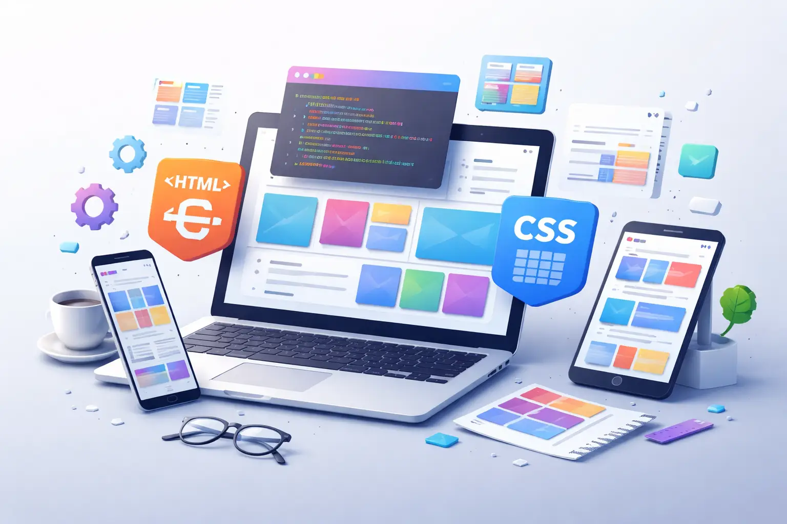
5. Live Demo
Here is a visual preview of the layout. This is how your result should look.
Resize your screen and imagine how it stacks. That is exactly what your code is doing.
6. Test It Yourself
Open your browser and resize the window. Watch how the layout reacts. This step is important. You learn more by seeing changes than just reading code.
If something breaks check simple things first. Missing class names, wrong file paths or small syntax mistakes are usually the cause. Most problems come from small details.
7. Improve It Step by Step
Once you understand the base you can expand it. Add a footer. Add a navigation bar. Try different layouts. You do not need to rush.
For example you can center content or add spacing like this:
.container {
  display: flex;
  gap: 20px;
  justify-content: center;
}
Small changes like this make a big difference in how the layout feels.
8. Real Example Practice
Try building something simple using the same structure. For example a blog layout with content and sidebar. Or a small dashboard.
Do not copy everything exactly. Change values. Break things. Fix them again. That is how you get comfortable with it.
“The moment you start testing things yourself is when layout starts to feel natural.”
After a few tries you will not think too much about Flexbox. You will just use it without overthinking every line.
That is the goal. Not just memorizing things, but actually understanding how they work.