
There comes a moment when you stop thinking only about making things work and you start noticing how they feel. That shift usually happens after building a few real pages. You open something you made before and it works fine, but it does not feel smooth. That is where small UI details start to matter more.
Buttons are one of the easiest ways to see this difference. At the start you just need something clickable. Later you realize that the way a button looks and reacts can guide people without saying anything.
In this tutorial you will build different button styles from scratch. You will also see how to style them properly and add small interactions with JavaScript so they feel alive. Everything here is simple and reusable.
What to focus on
Spacing feedback and consistency matter more than complex effects. A clean button that reacts well is always better than something flashy.
1. Basic Button
Start simple. This is the base you will reuse everywhere.
<button class="btn-basic">Click Me</button>

.btn-basic {
  background: #111827;
  color: #fff;
  padding: 10px 20px;
  border: none;
  cursor: pointer;
}
2. Soft Hover Button
A small hover change already improves the feel.
<button class="btn-soft">Hover Me</button>

.btn-soft {
  background: #374151;
  color: #fff;
  padding: 10px 20px;
  border: none;
  transition: 0.3s;
}

.btn-soft:hover {
  background: #111827;
}
3. Gradient Button
Use this when you want the main action to stand out.
<button class="btn-gradient">Get Started</button>

.btn-gradient {
  background: linear-gradient(45deg, #6366f1, #8b5cf6);
  color: #fff;
  padding: 12px 25px;
  border: none;
  border-radius: 30px;
}
4. Outline Button
Perfect for secondary actions.
<button class="btn-outline">Learn More</button>

.btn-outline {
  background: transparent;
  border: 2px solid #111827;
  color: #111827;
  padding: 10px 20px;
}

.btn-outline:hover {
  background: #111827;
  color: #fff;
}
5. Shadow Button
Adds depth and makes it feel clickable.
<button class="btn-shadow">Download</button>

.btn-shadow {
  background: #2563eb;
  color: #fff;
  padding: 10px 20px;
  border: none;
  box-shadow: 0 8px 20px rgba(0,0,0,0.2);
}

.btn-shadow:hover {
  transform: translateY(-2px);
}
6. Rounded Modern Button
Soft and clean style used in many apps.
<button class="btn-modern">Sign Up</button>

.btn-modern {
  background: linear-gradient(45deg, #0ea5e9, #22d3ee);
  color: #fff;
  padding: 12px 25px;
  border: none;
  border-radius: 999px;
}
7. Full Width Button
Great for mobile and forms.
<button class="btn-full">Continue</button>

.btn-full {
  width: 100%;
  background: #16a34a;
  color: #fff;
  padding: 12px;
  border: none;
}
8. Glass Button
Works best on dark backgrounds.
<button class="btn-glass">Glass Button</button>

.btn-glass {
  background: rgba(255,255,255,0.1);
  color: #fff;
  padding: 10px 20px;
  border: 1px solid rgba(255,255,255,0.2);
  backdrop-filter: blur(10px);
}
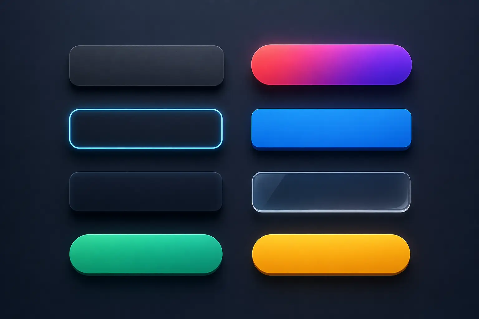
9. Live Demo
This shows how buttons look together in a real layout.
Try the buttons
Simple UI with different actions
“Good UI is not about more effects. It is about the right ones used in the right place.”
Now you have a full set of buttons that you can reuse. Try changing colors spacing or sizes and see how it affects the feel. That is where you really start understanding UI.