
When I first started building landing pages for products I used to focus too much on how things looked and not enough on how people actually use the page. It is easy to get caught up in colors and layouts but if the visitor does not understand what to do next the design does not really matter.
Over time I realized that simple pages usually perform better. A clear message a visible button and a layout that feels natural when scrolling. That is what makes the difference.
In this tutorial we are going to build a small ecommerce landing page from scratch. No frameworks no complicated setup just HTML and CSS. The idea is to create something that looks clean and could actually be used as a starting point for a real store.
Quick Insight
A good product page is not about adding more elements it is about guiding the user clearly from first view to action.
1. Project Setup
Create a new folder and name it:
ecommerce-landing
Inside the folder create two files:
index.html
styles.css
2. HTML Structure with Navigation
Open index.html and add this:
<!DOCTYPE html>
<html lang="en">
<head>
  <meta charset="UTF-8">
  <meta name="viewport" content="width=device-width, initial-scale=1.0">
  <title>Nova Store</title>
  <link rel="stylesheet" href="styles.css">
</head>
<body>

  <nav class="navbar">
    <div class="logo">Nova</div>
    <ul>
      <li><a href="#">Home</a></li>
      <li><a href="#">Products</a></li>
      <li><a href="#">Contact</a></li>
    </ul>
  </nav>

  <header class="hero">
    <div class="container">
      <h1>Modern Products for Everyday Life</h1>
      <p>Simple design built for daily use and fast delivery</p>
      <a href="#" class="cta">Shop Now</a>
    </div>
  </header>

  <section class="products">
    <div class="container grid">

      <div class="card">
        <h3>Wireless Headphones</h3>
        <p>Clean sound and minimal design</p>
        <button>Buy Now</button>
      </div>

      <div class="card">
        <h3>Smart Watch</h3>
        <p>Track your day with style</p>
        <button>Buy Now</button>
      </div>

      <div class="card">
        <h3>Portable Speaker</h3>
        <p>Strong sound in a compact size</p>
        <button>Buy Now</button>
      </div>

    </div>
  </section>

</body>
</html>
3. Styling Everything
Now open styles.css and add this:
body {
  margin: 0;
  font-family: Arial, sans-serif;
  background: #f9fafb;
}

.navbar {
  display: flex;
  justify-content: space-between;
  padding: 20px 40px;
  background: #111827;
  color: #fff;
}

.navbar ul {
  display: flex;
  gap: 20px;
  list-style: none;
}

.navbar a {
  color: #fff;
  text-decoration: none;
}

.hero {
  min-height: 80vh;
  display: flex;
  align-items: center;
  justify-content: center;
  background: linear-gradient(135deg, #1f2937, #111827);
  color: #fff;
  text-align: center;
}

.container {
  max-width: 1100px;
  margin: auto;
  padding: 20px;
}

h1 {
  font-size: clamp(2.5rem, 5vw, 3.5rem);
}

.cta {
  display: inline-block;
  margin-top: 20px;
  padding: 14px 28px;
  background: #3b82f6;
  color: #fff;
  border-radius: 6px;
  text-decoration: none;
}

.products {
  padding: 80px 20px;
}

.grid {
  display: grid;
  gap: 20px;
}

.card {
  background: #fff;
  padding: 30px;
  border-radius: 10px;
  text-align: center;
}

.card button {
  margin-top: 15px;
  padding: 10px 20px;
  background: #111827;
  color: #fff;
  border: none;
  border-radius: 5px;
}
4. Responsive Layout
@media (min-width: 768px) {
  .grid {
    grid-template-columns: repeat(3, 1fr);
  }
}
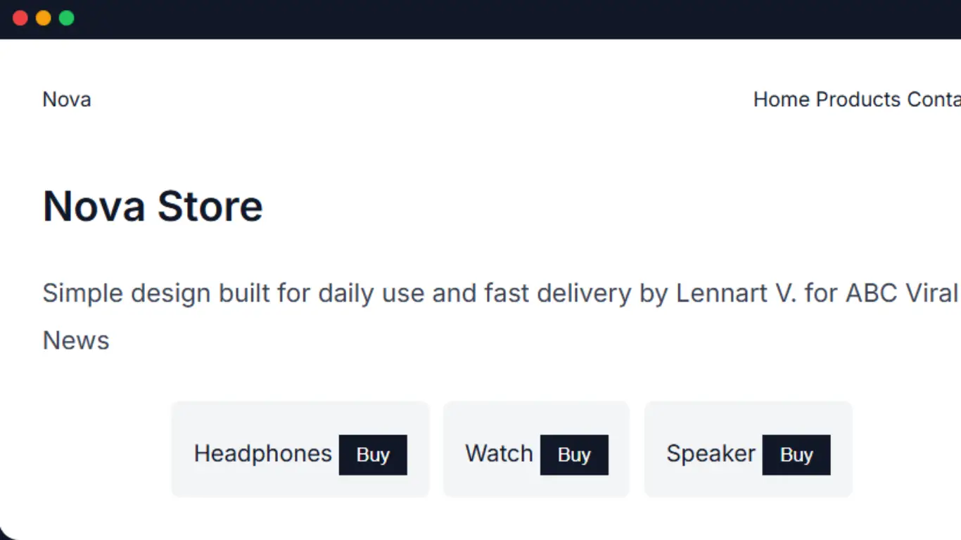
5. Live Demo
Here is a preview of how your final landing page should feel. This is styled like a real interface with navigation, products and clear actions.
Nova Store
Simple design built for daily use and fast delivery by Lennart V. for ABC Viral News
If your layout looks similar to this then everything is working correctly. You now have a simple but structured landing page.
“Clean structure clear actions and simple design always perform better than complex layouts.”
From here you can expand it by adding images pricing or checkout features. But even this version is a strong base.