If you’ve been checking out newer websites lately you’ve probably felt that something is different. Pages look cleaner, things are easier to follow and nothing feels overloaded. It’s not just a random trend it’s how web design is moving in 2026.
For a long time the goal was to make websites look impressive. More animations, more sections, more effects. And yeah visually it looked good but in many cases it was too much. Users had to think more than they should just to understand what was going on.
Now the focus is shifting. Instead of trying to show everything designers are starting to remove things. Not in a lazy way but in a way that makes the page easier to use.
Key Insight
Design in 2026 is less about adding features and more about making things easier to understand.
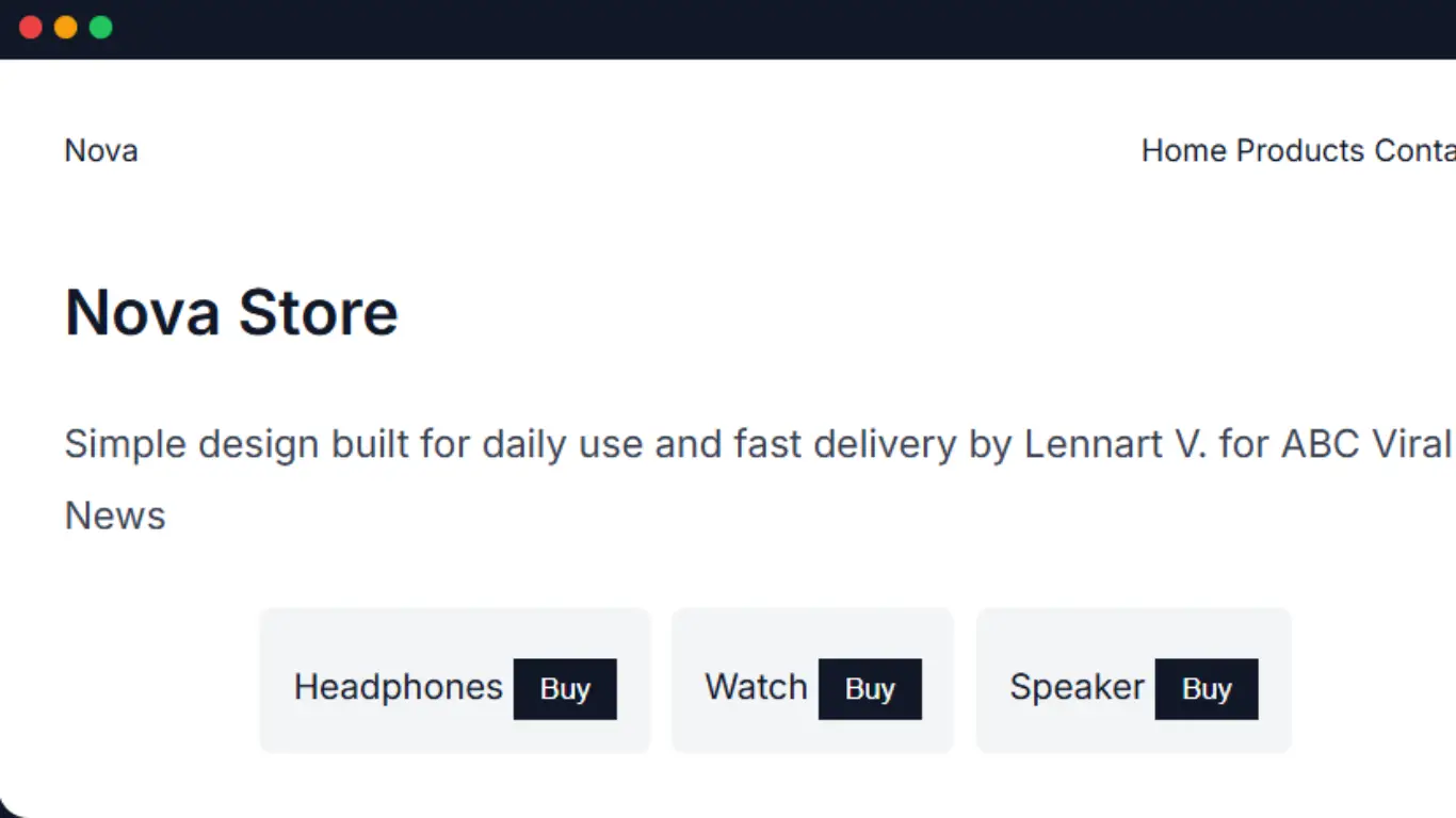
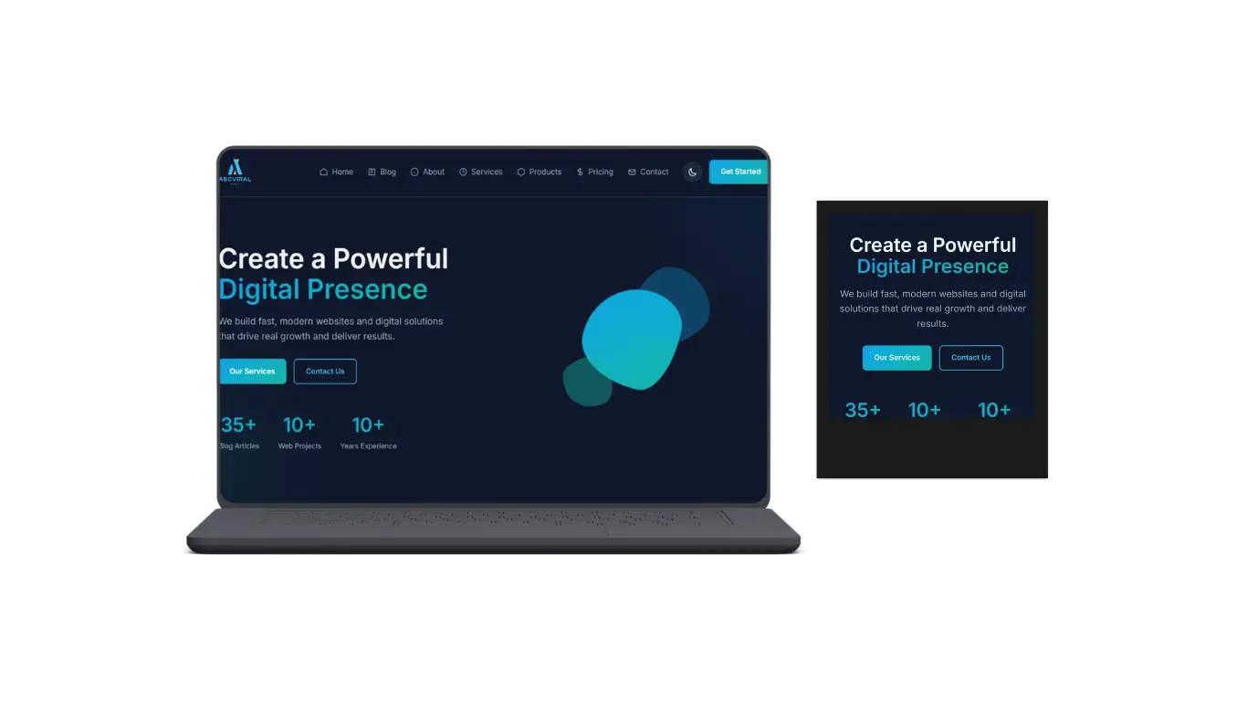
One thing that stands out right away is how focused pages are becoming. Instead of ten different sections fighting for attention most modern layouts push one main idea. One message, one action. That’s it.
It actually makes a big difference. You don’t need to figure out what to do. It’s already clear the moment the page loads.
Another thing that changed a lot is spacing. Before empty space felt like something you had to fill. Now it’s the opposite. Leaving space between elements makes everything easier to read and less stressful to look at.
Text becomes clearer buttons stand out more and the whole layout feels more balanced. It’s one of those small things that changes the entire feel of a website.
Performance is also a big reason behind this shift. People don’t wait anymore. If a site feels slow they leave. Because of that designers are being more careful with what they add.
Heavy animations and oversized elements are slowly disappearing. Not completely but they are used more carefully now. Instead of big effects you see small transitions hover states and subtle movements.
Mobile plays a big role in this too. Most users are on their phones so everything has to work well on smaller screens first. When you design like that you’re forced to keep things simple.
There’s no space for unnecessary elements. Everything needs a reason to be there.
Typography is also getting more attention than before. Instead of relying on graphics many designs now use strong text to create impact. Bigger headings, better spacing and cleaner fonts do more than people expect.
You’ll notice that some of the best-looking websites right now are actually very simple. No crazy visuals just good structure and clean design.
Another thing that’s becoming more important is consistency. Buttons look the same across the site spacing follows a pattern and interactions feel predictable.
At first that might sound boring but it actually makes everything easier to use. You don’t have to guess what will happen when you click something.
Animations are still there but they are different now. Instead of big flashy effects you get small details. A button moves slightly a card lifts a bit a transition feels smooth.
It’s not something you always notice directly but you feel it while using the site.
“Good design today is more about how things feel than how much you can show.”
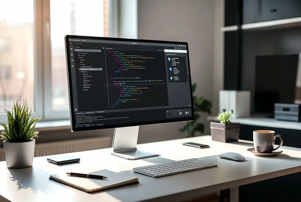
Something else that’s interesting is how design and development are getting closer. Designers are thinking more about performance and structure while developers are paying more attention to UI details.
It’s not as separated as before. Both sides are kind of meeting in the middle now which usually leads to better results.
If you’re building websites yourself this shift actually helps. You don’t need to create something complicated to make it look good. In most cases keeping things clean and simple works better.
Spacing, alignment, button styles, small interactions... these are the things that matter now.
A lot of developers used to focus only on functionality. Now, how things look and feel is just as important.
And honestly this direction makes sense. Websites are faster easier to use and less overwhelming. You don’t feel like you’re fighting the UI just to get something done.
If you look at newer projects or redesigns you’ll see the same pattern again and again. Less noise more clarity.
It’s not about doing less work. It’s about making better decisions with what you include.
So if you’re working on something right now it’s worth thinking about this. Instead of adding more sections or effects try removing things that are not really needed.
Most of the time that alone improves the whole page.